山西 / SX_C3
山西 — 茶之领地
连贯的贸易地理:南道、祁县大院、北驼队。
已审核可发布 · 已查看图画并对当前文件进行技术检查
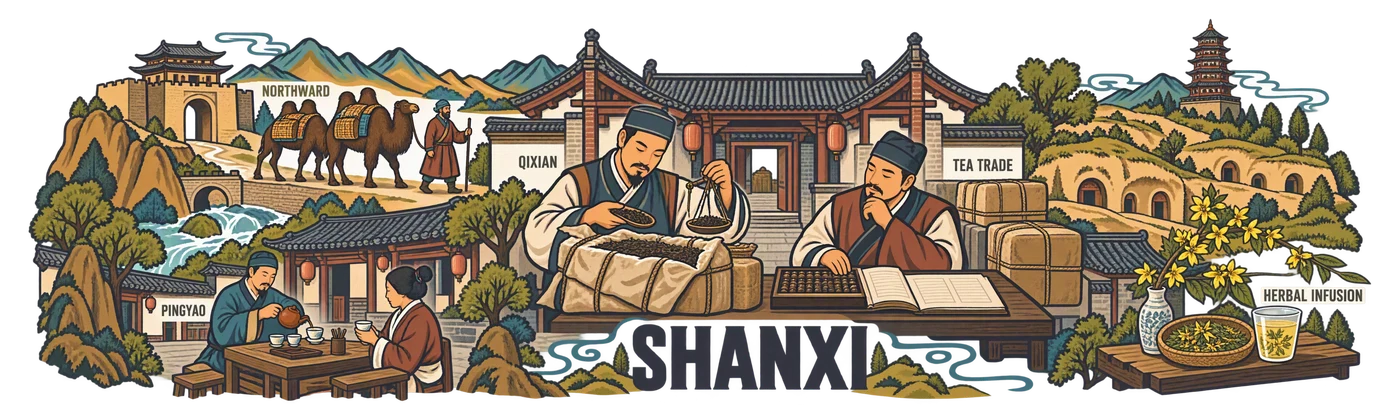
250 × 75 毫米 · 3840 × 1152 像素 · RGBA · 390.144 / 390.144 ppi
审核依据
修正后的 SHANXI 及所有贸易标注均可读;之前不可读的痕迹已删除。线条锐利,清晰的称叶、算盘/账簿、茶桌和商队;花草茶单独展示。干净丰富的图形符合 C3。
PNG RGBA 3840 × 1152 像素;真实 alpha 通道;按比例导出 250 × 75 毫米。
经审阅后允许用于开放画廊;并不意味着用户认可工业化批量生产。
创作方案配色
#3A3C49
#B28A39
#797356
#A85A4C
#739C9F
原始生成提示词
文本与公开 TXT 一致。铭文与细节清单描述的是作者任务;并非 OCR,也不承诺在缺少所用参考的情况下可复现。
SHA-256: 2530c0e8bd325a007c9ea03ae5748bb04bd23a42b875a6c0ba3bdbf97bf4262d
阅读完整提示
RENDERING REQUIREMENTS: Produce a new, completely crisp region-specific illustration. Borrow ONLY drawing style from the references; do not copy their region, title or place names. Use the exact region and English lettering in the brief. No blurred patches, mist, smoky shading, translucent brush smears or soft-focus architectural details. No clipping of objects or letters: keep an 80-pixel clear safety margin around the complete composition. True PNG RGBA transparency between the drawn shapes; no opaque white or coloured backing. Sharp ink edges, legible deliberate lettering.

Create one exceptional, completely flat regional ceramic-print artwork. This is the actual printable illustration, never a cup, product photograph, mockup, presentation board or simulated ceramic surface. The collection reference controls drawing language only: invent a new composition for the specified region and replace all Guangdong-specific objects. The source map supplies a regional inventory, not a paper texture or a layout to trace literally.

TECHNICAL CONTRACT: native canvas exactly 3840 x 1280 pixels, true RGBA PNG. Keep every visible mark, letter, ornament and antialiased edge inside x=60..3780 and y=110..1170. The final delivery will use a centered 3840 x 1152 export for a 250 x 75 mm wrap; leave the native safety area completely transparent. Compose for a long horizontal physical print, not a conventional poster. Nothing is cut off at either end. All exterior space and meaningful holes between objects must have alpha zero. No painted background, white underpainting, sky rectangle, tinted paper, land silhouette, colour fog, opaque backdrop or checkerboard. The wearer-visible ceramic supplies the unprinted space. Use the specified colours as ink, with normal edge antialiasing; do not invent extra white, black or metallic ink. Never print dimensions, crop marks, palette swatches, filenames, reference names or instructions.

ART DIRECTION: create a memorable hierarchy, a major focal scene and a quieter counterweight; alternate large close forms with medium stories and a few small discoveries. Let tea life interact with the region. Connect selected objects through a real roofline, tabletop, lane, ridge or river contour; retain clear breathing channels so each gesture and vessel is legible. Do not impose any percentage of empty space. Avoid both a cramped rectangular carpet and timid isolated stickers. Use confident, intentional linework that will survive the 75 mm print height. Limit texture to useful material clues. Any water, snow, steam or clouds are sparse outlines with transparent interiors, never washed fills. No photographic gradients, glow, heavy grunge, blurred edges or tiny illegible hatch fields.

FACTUAL DISCIPLINE: the scenes below distinguish cultivation, processing, trade, hospitality and non-tea infusions. Do not turn imported tea, berries, ginseng, barley, trees or grasslands into tea plantations. Do not invent a local tea cultivar, a named historic tea shop, medical effects, a precise trade route or archaeological evidence. Landmarks are cultural/geographic motifs, not assertions that tea was grown or traded at their gates. A contemporary tea pause next to a landmark is an authored scene, not a documentary historical claim. Keep people natural and respectful, with plausible hands and gestures; use no decorative pseudo-script.


C3: LIVING TEA TERRITORIES. Make an oblique, connected illustrated tea world, held together by a locally meaningful river, street, mountain fold or caravan corridor. Large foreground hospitality or craft overlaps medium buildings and small distant geography. Five flat inks, expressive editorial drawing and carefully observed vessels. No administrative outline, amusement-park badge grid or generic ornamental tea leaves. Integrate a strong condensed regional heading in the lower rhythm, not in a separate title band.

REGION: Shanxi. Exact ink palette: #3A3C49, #B28A39, #797356, #A85A4C, #739C9F. The first colour supplies the main line; the others have deliberate separate roles, not gradients.

AUTHENTIC SUBJECT MATTER:
Shanxi is a merchant tea region. Center the drawing on a Qixian/Zhaoyu-style courtyard where a trader opens a wrapped tea bale, another uses a balance and scoop to assess imported leaves, and a seated merchant keeps an abacus beside a plain open ledger with no legible invented writing. A second, lower Pingyao-style guest table offers a small teapot and cups: commerce becomes hospitality. At the northern end, two Bactrian camels and a handler approach a modest Yanmen/Shahukou-type gate, expressing the documented northward trade corridor without printing dates or a precise total distance. The bales contain tea, not fictitious local leaves picked from mountains. A small, separate Lingchuan/Tunliu forsythia-leaf infusion appears as a slender flowering branch, leaf tray and glass; label it as herbal if labelled at all. Do not turn the map caption Shangdang Tea into terraces of Camellia. A few loess dwelling arches and a distant wooden pagoda establish the regional setting. No tea-pressing machinery or invented banknotes, no Shanxi/Shaanxi spelling confusion.

SPECIFIC COMPOSITION:
Create a connected sequence from southern pass to merchant courtyard to northern gate. A large central tea-inspection table is the human hinge: an open bale, balanced scale, leaf scoop and two merchants. The lower path passes a guest teapot and abacus, then climbs behind the courtyard into a small Bactrian caravan. Loess cave arches and a distant pagoda establish depth; the small separate forsythia infusion occupies an off-route household shelf. Integrate the title low beside the path. This is the geography of commerce and hospitality, not cultivation, with varied sizes and air between roofs and camel legs.

VISIBLE TYPE: exact main title "SHANXI" once. Use only these optional small English labels, integrated beside the appropriate scenes and large enough to read: QIXIAN, TEA TRADE, PINGYAO, NORTHWARD, HERBAL INFUSION. Do not add other text. No Chinese characters, bilingual captions, pseudo-calligraphy, gibberish, slogans, logos or signatures. Prioritize visual storytelling over words. Do not allow letters to merge with foliage or buildings. The design must feel like a collectible regional artwork that a tea professional would want to handle and study.