Цинхай / QH_C5
Цинхай — Парад достопримечательностей
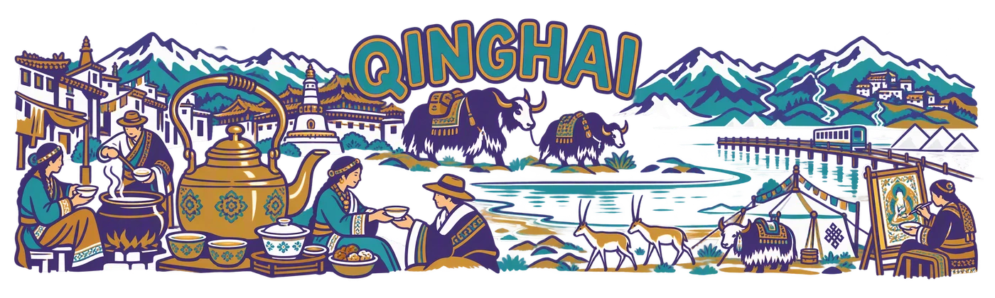
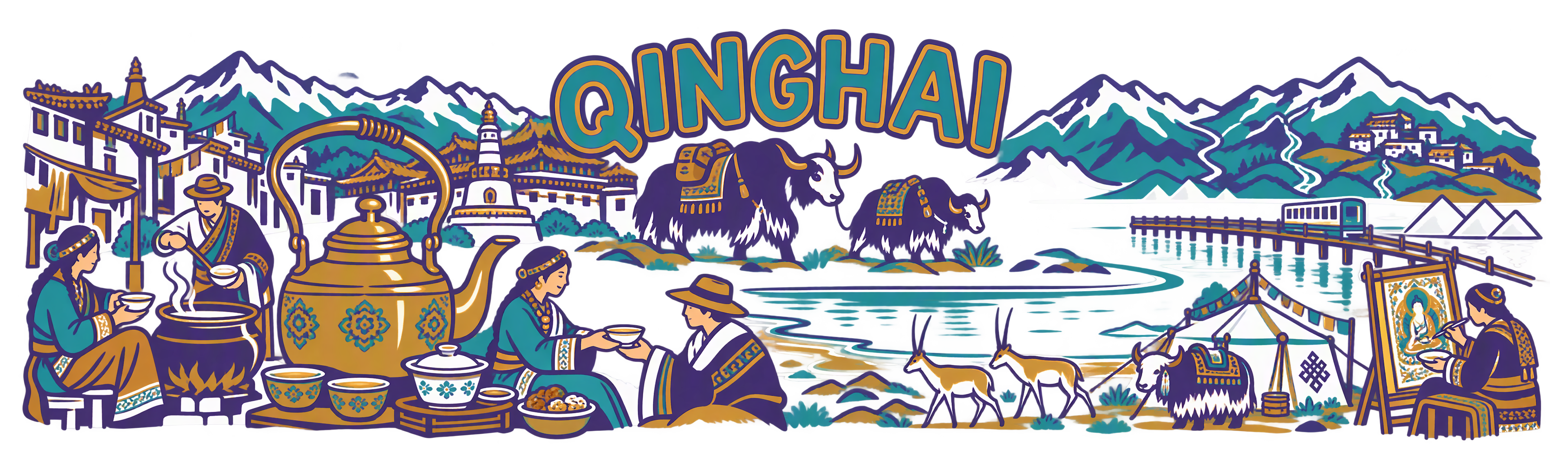
Тёплый контурный парад разных сосудов и людей, як, озеро и ступенчатые крыши.
Проверено для публикации · Просмотр рисунка и техническая проверка текущего файла
Региональное исследование и источники
Основание проверки
Просмотрен яркий контурный парад Qinghai: большой чайник, подача чая, як, озеро/соляное озеро, горы, антилопы и танка. Чистые уверенные линии, крупное полное название, настоящие прозрачные просветы; чай изображён как культура потребления.
PNG RGBA 3840 × 1152 px; настоящий альфа-канал; пропорциональный экспорт 250 × 75 мм.
Допущен после просмотра для открытой галереи; не означает утверждение пользователем промышленного тиража.
Палитра авторского задания
#4C467C
#3F9AA1
#AC8743
Точное текстовое задание
Текст совпадает с публичным TXT. Перечень надписей и деталей описывает авторское задание; это не OCR и не обещание воспроизводимости без использованных референсов.
SHA-256: 9058fc13be9c8639b9152ab45fc1016431be2b3889f92509b0f09d1537012b46
Прочитать полный промпт
Create one exceptional, completely flat regional ceramic-print artwork. This is the actual printable illustration, never a cup, product photograph, mockup, presentation board or simulated ceramic surface. The collection reference controls drawing language only: invent a new composition for the specified region and replace all Guangdong-specific objects. The source map supplies a regional inventory, not a paper texture or a layout to trace literally.

TECHNICAL CONTRACT: native canvas exactly 3840 x 1280 pixels, true RGBA PNG. Keep every visible mark, letter, ornament and antialiased edge inside x=60..3780 and y=110..1170. The final delivery will use a centered 3840 x 1152 export for a 250 x 75 mm wrap; leave the native safety area completely transparent. Compose for a long horizontal physical print, not a conventional poster. Nothing is cut off at either end. All exterior space and meaningful holes between objects must have alpha zero. No painted background, white underpainting, sky rectangle, tinted paper, land silhouette, colour fog, opaque backdrop or checkerboard. The wearer-visible ceramic supplies the unprinted space. Use the specified colours as ink, with normal edge antialiasing; do not invent extra white, black or metallic ink. Never print dimensions, crop marks, palette swatches, filenames, reference names or instructions.

ART DIRECTION: create a memorable hierarchy, a major focal scene and a quieter counterweight; alternate large close forms with medium stories and a few small discoveries. Let tea life interact with the region. Connect selected objects through a real roofline, tabletop, lane, ridge or river contour; retain clear breathing channels so each gesture and vessel is legible. Do not impose any percentage of empty space. Avoid both a cramped rectangular carpet and timid isolated stickers. Use confident, intentional linework that will survive the 75 mm print height. Limit texture to useful material clues. Any water, snow, steam or clouds are sparse outlines with transparent interiors, never washed fills. No photographic gradients, glow, heavy grunge, blurred edges or tiny illegible hatch fields.

FACTUAL DISCIPLINE: the scenes below distinguish cultivation, processing, trade, hospitality and non-tea infusions. Do not turn imported tea, berries, ginseng, barley, trees or grasslands into tea plantations. Do not invent a local tea cultivar, a named historic tea shop, medical effects, a precise trade route or archaeological evidence. Landmarks are cultural/geographic motifs, not assertions that tea was grown or traded at their gates. A contemporary tea pause next to a landmark is an authored scene, not a documentary historical claim. Keep people natural and respectful, with plausible hands and gestures; use no decorative pseudo-script.


C5: BOLD FRIENDLY LANDMARK PARADE. Confident rounded pen turns, double-contour regional lettering, reduced architectural silhouettes and a joyful procession of people, local travel motifs, vessels and landmarks. Three flat inks and spare patches of colour. Vary height and scale sharply; objects overlap through useful shared contours rather than being pasted in one equal-sized row. Tea must remain a visible living action in this mixed regional collection. Rounded does not mean infantile, and friendly does not mean generic.

REGION: Qinghai. Exact ink palette: #4C467C, #3F9AA1, #AC8743. The first colour supplies the main line; the others have deliberate separate roles, not gradients.

AUTHENTIC SUBJECT MATTER:
Contrast the low open oval of Qinghai Lake with the serrated Kunlun and Qilian skyline. Include a medium Kumbum roof group, a small Xining courtyard/market silhouette, a pastoral tent and one yak, two Tibetan antelope, a Chaka salt-lake pier or rail cue as spare lines, and a Repkong painter at a modest scroll frame. Three distinct tiny stream origins may descend from separate ridges, not one impossible junction of the great rivers. Yushu may appear as a small stepped roof cluster. A short pack-animal pair references the map journey without inventing a dated precise tea route. All water and snow remain transparent open forms. Tea service and the domestic pot stay more prominent than decorative mountains.

Tea anchors that remain visible: Hehuang copper-kettle Babao service, Huangyuan boiled brick-tea aocha, Mado butter-tea hospitality, and a modern lakeside tea pause.

SPECIFIC COMPOSITION:
Start with an oversized copper kettle and gaiwan, then let the playful double-contour QINGHAI title rise behind a pair of calmly moving yaks at different scales. A small monastery roof, two antelope and an open lake curve answer the tea pot in the lower middle. The painter, tent and Chaka pier form three deliberately unequal endings, not a matching parade of icons. One host ladles aocha into a bowl; another hands over butter tea. Use rounded bold contours and very few internal marks, keeping the important difference between kettle, cauldron and churn.

VISIBLE TYPE: exact main title "QINGHAI" once. The regional title is the only printed text. Do not add small location labels. No Chinese characters, bilingual captions, pseudo-calligraphy, gibberish, slogans, logos or signatures. Prioritize visual storytelling over words. Do not allow letters to merge with foliage or buildings. The design must feel like a collectible regional artwork that a tea professional would want to handle and study.